Let’s talk about book covers. Yes, let’s. Because if my Facebook feed is anything to go by, then of late cover art has been more miss than hit. No, seriously. If I see another book cover that looks like the “artist” went at it with Microsoft Paint, I will lose my goddamn mind.
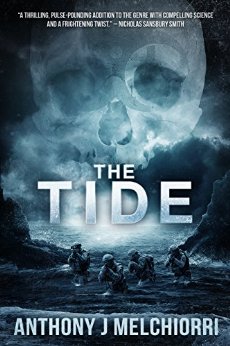
Now before I get my ranty-pants well and truly on, I won’t be filling this post with shite covers, but excellent ones by the amazing artist Dean Samed, who does all Cohesion Press covers. I’ll be talking about artists as well, because this is as much about the author as it is the artist – each is as responsible (or complicit) for the end product. I’ll get to publishers later in the piece… yep, no one gets out unscathed here!
Okay, authors, listen up. Covers matter. They matter a whole lot. It is the visual representation of the work within, and the first (yes, FIRST) point-of-contact for a potential reader (and buyer) of your book. A great cover will stop a reader in their tracks and have them pick up your book or click that link, and that’s half the battle won right there. And make no mistake, this is a battle. You’re competing with gazillions of other authors out there for potential readers, and a cover – a GOOD cover – will entice.

A shit cover? Well, move along, folks – nothing to see here. Readers are discerning; it’s their money they’re parting with, and if you haven’t put the effort into obtaining the best cover you can, why should they believe you’ve made the effort with the writing? Now I know people will be jumping up and down spouting: “you can’t judge a book by its cover!” Well I call bullshit. I most certainly will judge your book by its cover. And so will a whooooole bunch of others. That’s income. Your potential income you’re wagering on the hope that readers will forgive that shite cover and buy your book. But why would they when there’s a plethora of other great covers out there? Know that your crap cover will not find a place on my bookshelf. I’m not alone in this thinking.
A great cover will generate interest. It has the potential to be shared on social media platforms that will increase your reach and garner readers. It will put you and your book(s) on readers’ radar. You seeing the positives here?
But what makes a good cover, I hear you ask. A few things. A few very simple things.
- It must represent what’s inside. Hit your genre; don’t be putting a zombie on historical romance (unless it’s a zombie historical romance tale).
- Fonting should be clean, simple, and easy to read. Just because you’re writing horror, doesn’t mean your fonting has to be red… or dripping blood… (please stop doing that).
- Watch your elements. This is something I see quite a bit – filling the cover with too much stuff. Ooh, there’s a castle in the story, and an elf, and a magical sword…ooh, ooh, ooh, and a horse and a dragon, and, and, and… Don’t make it busy. It doesn’t draw the eye, it confuses it. Singularity is your friend here – one major element with one or two smaller complementary elements. It’s all about balance.
- Watch your colour. Background colour has to work with font colour. And the busier the palette, the harder it’s going to be to get that right.
- Do not, I repeat, DO NOT put ‘A Novel’ on the cover of a novel. We’re not idiots.
Now don’t get me wrong, there’s a bit more that goes into it than the above five points, but those ↑ up there are some pretty straightforward things to keep in mind when engaging a cover artist. You will be the one providing the artist the brief (some artists won’t have time to read your novel, so they rely on you to give them the information they need), so don’t overload them with every single piece of the plot and every character, but give them the main focus points and trust them – they’re the artist, they know what they’re doing.

And therein can sometimes lie the rub. Not all who claim to be cover artists, actually are. I’ve seen sites popping up on my social media pages with people proclaiming they’re cover artists and offering their ‘work’ for either a pittance, or way too much for the end product. Just because you can mock up a cover and throw some fancy fonting (not always a good choice) over it, doesn’t make you a cover designer. Really, it doesn’t.
Thing is, there are plenty of fantastic cover artists/designers out there who offer amazing work for reasonable prices. You invested in editing (please, tell me you invested in editing), so invest in the coat your baby is going to wear. It doesn’t have to be original art (although there’s something extraordinarily special about those covers), but there are designers out there who work wonders with stock photography who know how to blend the hell out of it to make it seamless.
Dean Samed of NeoStock is a brilliant creative who knows his shit. He understands books and the power of covers, he knows how to blend and manipulate and manoeuvre images to create some mind-blowing covers. Dean understands the market, he understands covers, and he knows his art. He’s also seen a gap in the market when it comes to stock photography, and has started NeoStock – check it out if you’re looking for original stock art that kills what’s currently on offer around the web.
So how do you find a good artist? Again, this is simple. Ask. Get on your social media platforms, send out a request. Sure, you’re going to get contacted by some crap “artists” that’s par for the course, but you could find that gem you’re looking for. Chat to other authors, get recommendations from them. Check out other book covers, and if you find a cover you love check the front matter to see if the artist is listed (they usually are), or get in touch with the author and ask. Deviantart is also a great place to scope artists. While they may not be able to mock up a cover for you, they will provide you with art that doesn’t look like a toddler went at it with crayons.
And if you think readers don’t mind what a cover looks likes, think again. There are whole websites dedicated to the shittiest of shittest covers (see here and here for some examples). Trust me, you don’t want to end up on these websites, it will be nothing but scorn and derision. And that pretty much sucks for you re sales.
So think about the cover you’re wanting to put on your book, find an artist who knows what they’re doing (look at their portfolio or ask to see previous work, and don’t be afraid to say ‘thanks, but no thanks’ – you can do that, you know), and get yourself the best cover you possibly can. You’ll be proud of the end-product, and your readers will thank you for putting in the effort to make your book awesome both inside and out. Don’t short-change your book, and don’t short-change the reader.

And if you’re a publisher don’t short-change your author or their work. If you want to be taken seriously in this industry, if you want to make a go of this business then you have to take this seriously, too. Don’t hire your friend’s kid’s uncle’s intern to do the work – INVEST in the cover like you’re investing in the author. The Big Five are as guilty of this as mid-to-small presses and author-publishers. Of late, the Big Five have been seriously dropping the ball when it comes to cover art. So do better. Be better. If you, as a publisher, want to see a return on your investment, then you need to offer a product that hits the mark on all fronts. That means kick-arse covers.
For those of you thinking this isn’t as important as I’m telling you it is, you’re wrong, so very wrong. Social-media marketing will definitely help with sales, but if you’re doing that with a shite or mediocre cover, you’re limiting your reach. Yes, family, friends and colleagues will buy your book, but if you want to be successful, then you have to reach those who wouldn’t normally know of you, and the best way to do that is to have a cover that makes them sit up and take notice. They’ll share it, then their friends will share it. Covers can do that. They’re magical if done well. And who doesn’t love a bit of magic? It’s why we write.
Oh, and for the love of all things holy and unholy DON’T DO IT YOURSELF. NO. I DON’T CARE IF YOU THINK YOU CAN, YOU CAN’T. LEAVE IT TO THE PROFESSIONALS! YOU THERE, PUT DOWN THAT MICROSOFT PAINT AND STEP AWAAAY FROM THE PC!
Remember, just because you can doesn’t mean you should.